
"A logo does not sell (directly), it identifies. It is only by association with a product, a service, a business, or a corporation that a logo takes on any real meaning." – Paul Rand
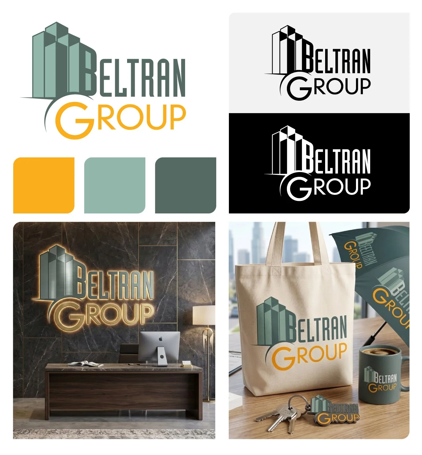
Beltran Group
Role: Creative Director / Designer
Project Type: Real Estate / Brand Identity
About the Project: Beltran Group Realty is a real estate firm focused on navigating the complexities of the modern property market. The goal was to develop a visual identity that felt both structural and approachable, reflecting the stability of the industry while maintaining a fresh, contemporary edge for their clientele.
The Design Solution: The final identity centers on a refined wordmark integrated with architectural elements to symbolize growth and urban development. To ensure the brand resonated across every client touchpoint, the scope of work extended beyond the digital space into a comprehensive suite of physical brand collateral. From professional business cards to lifestyle items like tote bags, umbrellas, and keychains, the result is a cohesive brand experience that feels as premium and reliable as the services they provide.
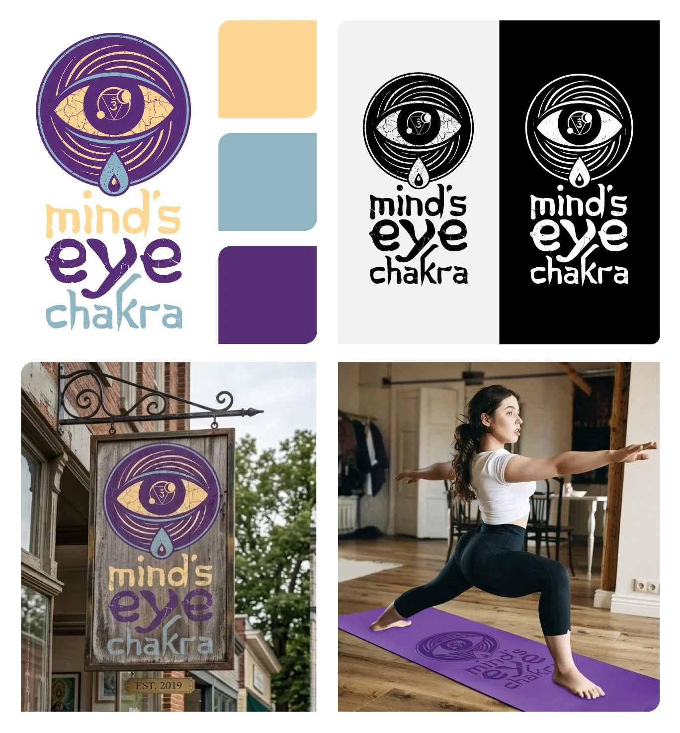
Mind’s Eye Chakra
Role: Creative Director / Designer
Project Type: Wellness / Holistic Identity
About the Project: Mind’s Eye Chakra is a startup wellness studio specializing in yoga and Reiki energy healing. The brand needed to bridge the gap between traditional spiritual symbolism and a modern, approachable studio environment. The goal was to create an identity that felt grounded and restorative, inviting clients into a space of mindfulness and healing.
The Design Solution: The visual identity centers on an illustrative, hand-rendered mark that incorporates the symbolism of the "Third Eye" and the flow of energy. By utilizing a distressed, organic texture and a palette of deep purples and warm earth tones, the brand avoids the clinical feel often found in the wellness industry. The scope of the project included the primary identity system and its application across various environmental and physical touchpoints—including rustic exterior signage and custom-branded equipment like yoga mats—ensuring the brand’s "high-vibe" energy is felt at every level of the guest experience.
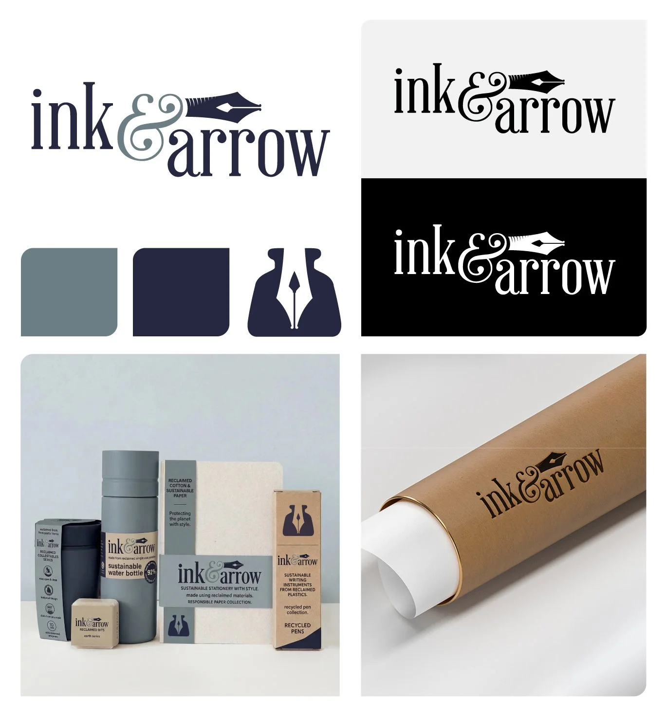
Ink & Arrow
Role: Creative Director / Designer
Project Type: Brand Identity / Sustainable Packaging
About the Project: Ink & Arrow is an emerging stationery brand built on the intersection of fine craftsmanship and environmental stewardship. The challenge was to create a visual language that appealed to the "conscious creator"—someone who values high-end design as much as they value the planet. The goal was to position the brand as a sophisticated yet responsible alternative in the boutique stationery market.
The Design Solution: The identity centers on a dual-purpose mark that merges a classic pen nib with the silhouette of an arrow, symbolizing both the act of creation and the forward-thinking nature of sustainable production. For the packaging suite, I prioritized a minimalist, "earth-first" aesthetic. Utilizing a palette of muted charcoals, creams, and natural kraft textures, the design communicates the brand's commitment to reclaimed and responsible materials without sacrificing a premium feel. The resulting system provides a cohesive experience across a diverse range of products, from recycled writing instruments to sustainable home goods, ensuring the brand’s message of "style with substance" is clear at every touchpoint.
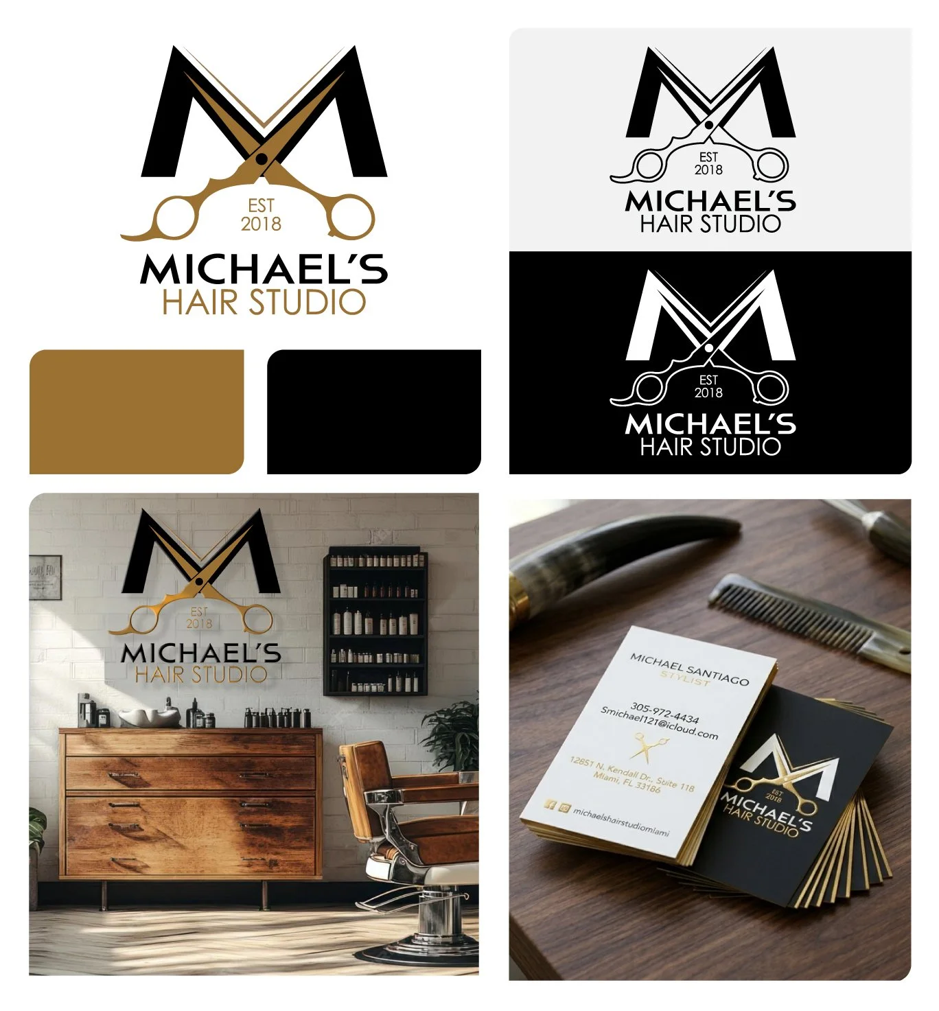
Michael’s Hair Studio
Role: Creative Director / Designer
Project Type: Boutique Retail / Visual Identity
About the Project: After years of building a reputation in a high-volume salon environment, Michael Santiago decided to "cut ties" with the corporate studio model to open his own boutique shop. The goal was to create an identity that reflected his high-level skill and individual attention to detail, positioning the studio as an exclusive destination for clients seeking a more intimate and elevated experience.
The Design Solution: The visual identity centers on a sophisticated monogram that seamlessly integrates professional shears into the letterform, creating a mark that is both recognizable and refined. To match the premium feel of the physical studio, the project extended into high-end brand touchpoints, including elegant business cards finished with gold foil and a custom backlit wall sign that anchors the interior design. The result is a cohesive brand that feels established yet fresh, providing Michael with a professional presence that matches the caliber of his work.
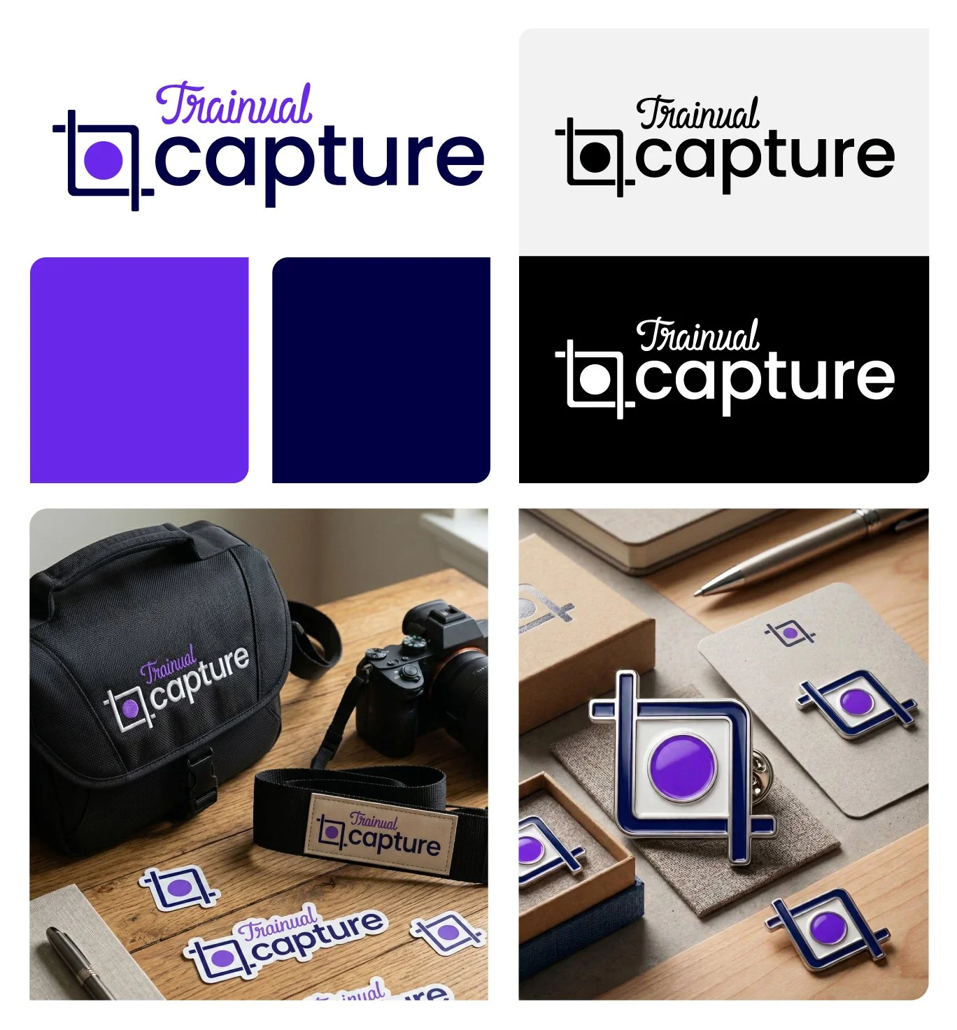
Trainual Capture
Role: Brand Manager/Lead Designer
Project Type: SaaS Product Identity / Brand Extension
About the Project: Trainual is a leading SaaS platform designed to help businesses automate their onboarding and training. "Capture" was developed as a key feature to streamline the documentation process, allowing users to record and document workflows in real-time. As the in-house brand manager, the goal was to create a sub-brand for this feature that felt like a natural extension of the primary Trainual identity while possessing its own distinct, "action-oriented" personality.
The Design Solution: The visual identity for Capture centers on an icon that merges the traditional screen-capture "crop" symbol with a central focal point, representing the ease and precision of documenting a task as it happens. Because Trainual places a high value on brand culture and physical touchpoints, the project expanded into an extensive suite of premium gear. This included custom-branded equipment bags, camera straps, and enamel pins—transforming a digital software feature into a tangible brand experience that employees and users can interact with daily.
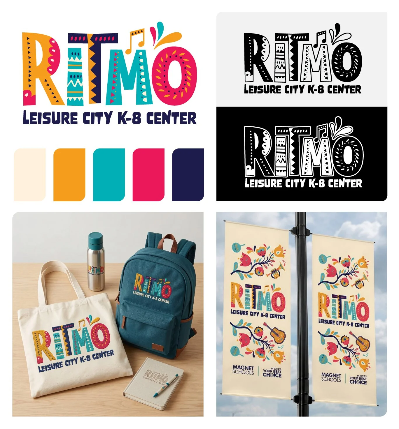
RITMO
Role: Creative Director / Lead Designer
Project Type: Educational Magnet Program / Cultural Identity
About the Project: RITMO is a historic initiative, serving as the first-ever mariachi music magnet program in the state of Florida for Miami-Dade County Public Schools. The objective was to create a visual identity that celebrated the rich heritage of Mexican culture while clearly communicating the program’s musical focus. The brand needed to feel inspiring for students and professional enough to stand as a flagship program for the district.
The Design Solution: The identity centers on a high-energy wordmark where each letter is infused with intricate geometric patterns and textures reminiscent of traditional folk art and textiles. To capture the essence of "rhythm," I integrated subtle musical cues—like the eighth-note flourish—into a palette that is both warm and celebratory. As the lead designer and director, I managed the brand’s rollout across a comprehensive range of touchpoints. This included large-scale environmental graphics and campus banners to define the program’s physical space, as well as a full suite of student gear—from embroidered backpacks and totes to stationery—building a sense of community and pride for the program’s inaugural class.
Balfour Uniforms
Role: Creative Director / Lead Designer
Project Type: Apparel / Academic Branding
About the Project: Balfour is a century-long heritage brand, often described as a “100-year-old startup.” While they are the established leaders in capturing student milestones—from class rings and yearbooks to championship jewelry—the launch of Balfour Uniforms represented a move into the daily fabric of student life. The challenge was to translate their reputation for craftsmanship and "celebrating the moments that matter" into a functional, high-quality apparel line. The goal was to ensure that a brand synonymous with graduation and achievement felt equally at home in the classroom every day.
The Design Solution: The visual identity is anchored by a modern heraldic crest, a timeless symbol of academic pride that bridges the gap between traditional school spirit and contemporary design. By utilizing a quadrant system to integrate brand initials with icons representing both the classroom and the commencement stage, the mark becomes a versatile centerpiece for the entire line. To ensure a premium first impression for school administrators, the project included a curated "sample experience." This featured custom-engineered shipping boxes, branded patterned tissue paper, and intricate embroidery for patches and polos. The resulting system transforms a standard product category into an elevated brand experience, reinforcing the quality and reliability that has defined the parent company since 1913.