
"If you’re not curious, you shouldn’t be a designer. You have to be looking at everything, all the time, from every era." – Seymour Chwast
Miami Dade College: Environmental Graphics
Role: Lead Designer
Project Type: Experiential Design / Environmental Graphics
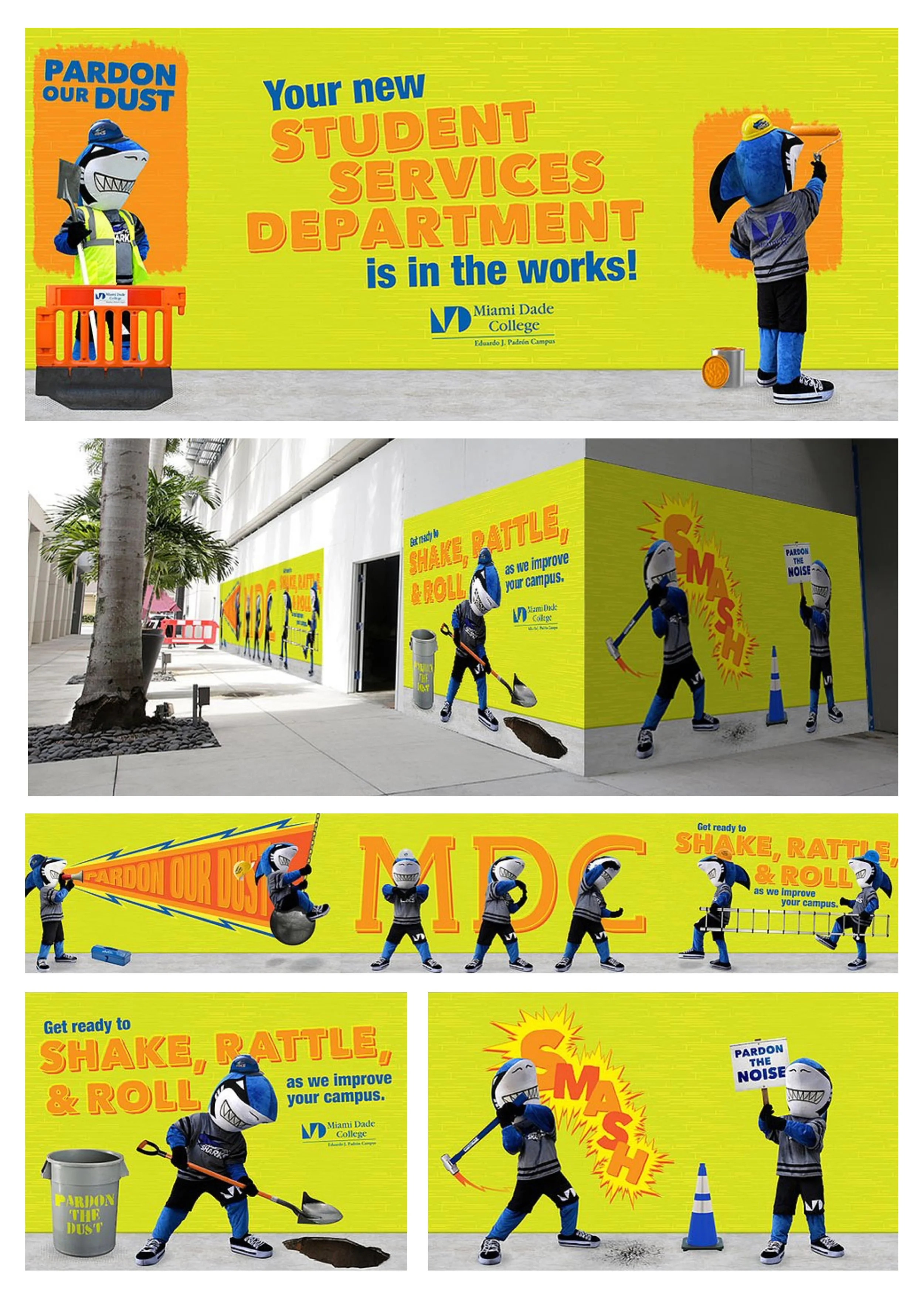
About the Project: During a major renovation of the Student Services Department at Miami Dade College’s Padrón Campus, the administration needed a way to mask the visual disruption of active construction. The goal was to transform massive, uninviting temporary walls into a vibrant brand experience that acknowledged the inconvenience while building excitement for the upcoming campus improvements.
The Design Solution: To keep the tone light and student-focused, I developed a character-driven campaign featuring the college’s shark mascot. I directed a custom photoshoot with the mascot in various "construction-mode" scenarios—utilizing props like shovels, sledgehammers, and safety gear to bring the campus improvements to life. These images were integrated into a series of large-scale wall wraps featuring high-impact typography and playful puns like "Shake, Rattle, & Roll." The result was a functional piece of environmental design that effectively hid the "dust" of construction while providing a social-media-friendly backdrop that boosted student morale and reinforced the college's commitment to growth.
Miami Dade College: Mascot Redesign
Role: Lead Designer/Illustrator
Project Type: Character Design / Brand Asset System
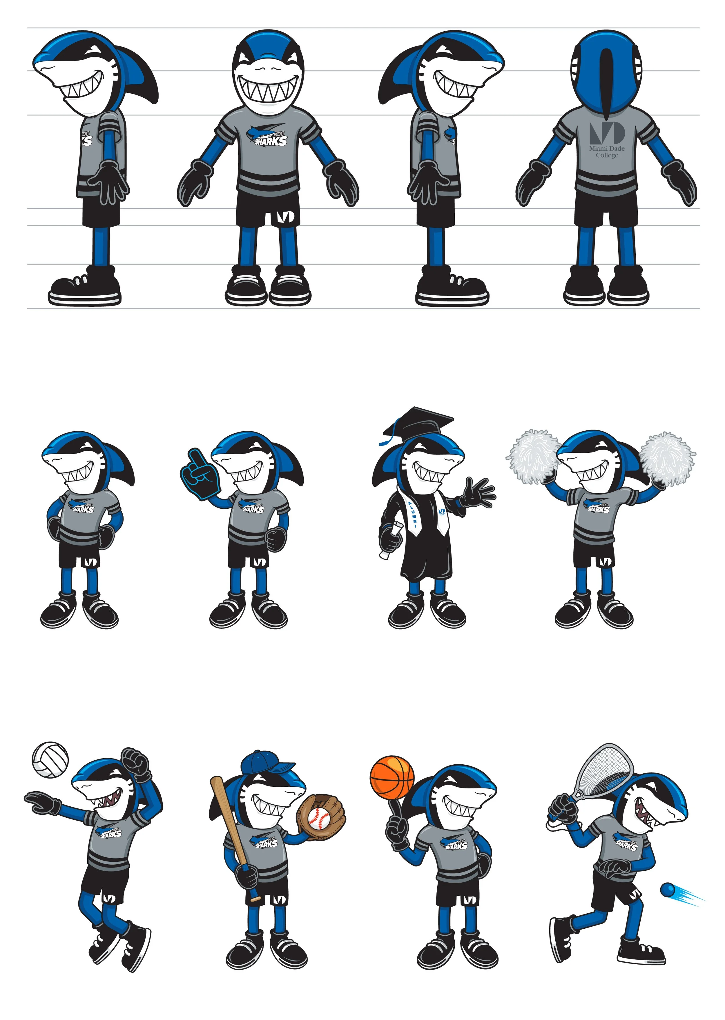
About the Project: Miami Dade College needed to revitalize their cartoon mascot, Finn, to better serve a diverse, multi-campus population. The previous iteration lacked the flexibility needed for the wide array of college departments, from athletics to academic honors. The goal was to create a "friendlier" Finn—a character that could act as a brand ambassador for everything from student orientation to specialized sports programs.
The Design Solution: Drawing inspiration from the "Golden Age" of animation, I re-envisioned Finn using a vintage, wholesome aesthetic. This "rubber-hose" style provides a high level of expressive versatility, allowing the character to remain recognizable while being easily adapted into various poses, uniforms, and scenarios. I developed an expansive library of Finn variations—including specific versions for baseball, tennis, volleyball, and graduation—creating a modular asset system that continues to evolve. This project transformed the mascot from a static image into a living, breathing part of the MDC campus culture, capable of representing any program or event with a consistent and welcoming personality.
Trainual: Phoenix Takeover
Role: Brand Manager / Lead Designer
Project Type: Environmental Design / OOH / Event Strategy
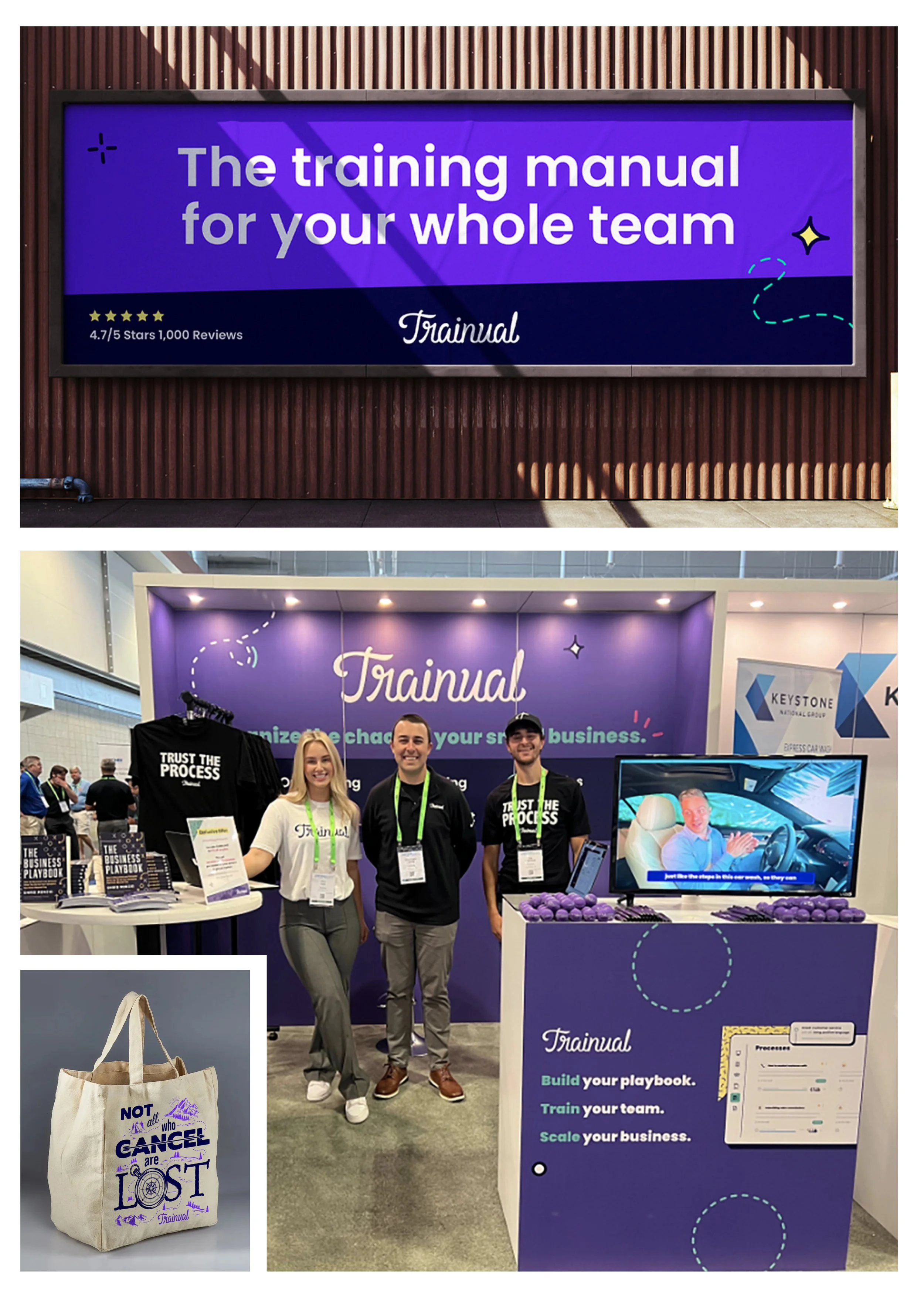
About the Project: Trainual is a SaaS leader with a highly defined brand aesthetic that rarely deviates from its established visual language. For a major industry event in Phoenix, AZ, the challenge was to extend this digital-first identity into the physical world. The scope included a high-visibility Out-of-Home (OOH) campaign surrounding the Phoenix Convention Center and the design of a trade show booth that served as a headquarters for the "Trainual vibe" in a high-traffic environment.
The Design Solution: The project was anchored by a series of high-impact billboards that greeted attendees upon arrival, establishing immediate brand authority. The trade show booth was designed as a modular, multi-sensory space featuring looping video content and a dedicated area for the brand's signature high-quality apparel. A key strategic layer included a "secret" engagement tactic: custom-designed tote bags for at-risk clients featuring the witty "Not all who cancel are lost" tagline. By pairing strict adherence to brand guidelines with clever, retention-focused collateral, the final result was a cohesive physical presence that maximized attendee engagement and reinforced customer loyalty.
Balfour Uniforms: Product Launch
Role: Creative Director / Lead Designer / Production Manager
Project Type: 360° Campaign / Production Management / Digital & Print Design
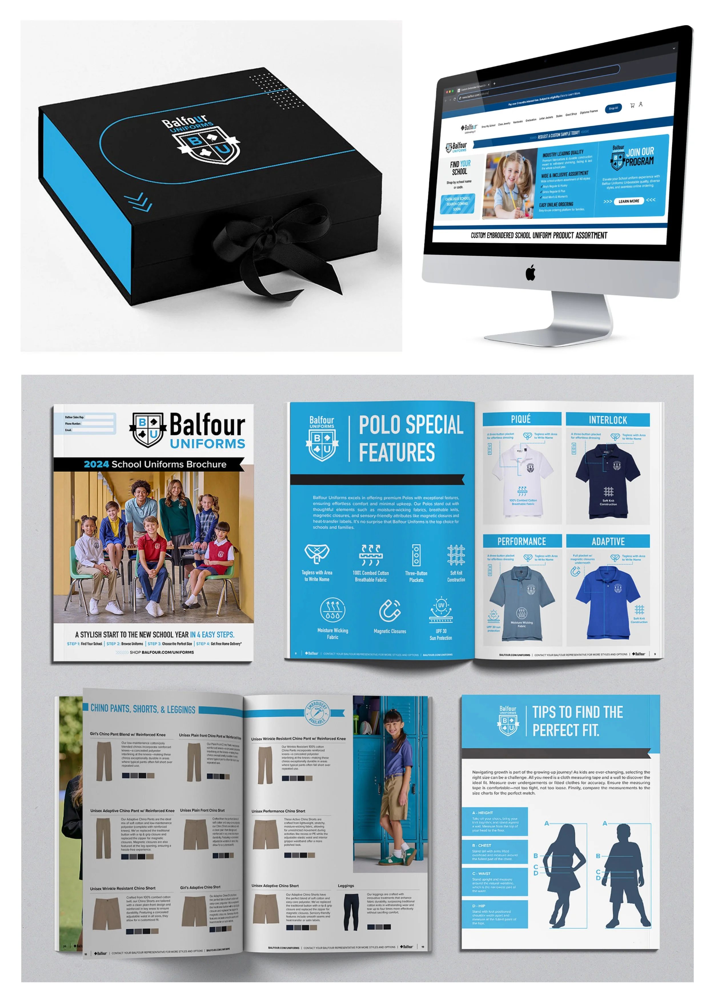
About the Project: As a legacy brand entering the competitive uniform market, Balfour needed a comprehensive go-to-market strategy for its new apparel line. The challenge was that no visual assets existed for this new product category. I was tasked with not only designing the full suite of marketing materials—including a detailed product catalog, digital landing pages, and a premium sampling box—but also managing the entire creative production from concept to execution.
The Design Solution: The solution required a "ground-up" approach to asset creation. I acted as the full Production Manager, responsible for location scouting, casting calls for young models, and hiring local photographers and production assistants. I directed the resulting multi-day photoshoots, capturing both individual product lay-downs and stylized outfit combinations. These custom visuals were then integrated into a cohesive visual system across all platforms. The physical catalog, responsive landing pages, and the curated sampling box provided school administrators with a high-touch, credible introduction to the brand, establishing Balfour Uniforms as a polished and professional choice.

Texas Exes: The Ring Vault
Role: Creative Director / Lead Designer
Project Type: Experiential Design / Conceptual Visualization
About the Project: The University of Texas Alumni Association, known as the Texas Exes, sought a conceptual vision for a "Ring Vault"—a dedicated sanctuary to house the legacy of the official UT ring. The objective was to design a space that functioned as both a high-security repository for every ring iteration since the program's inception and a "mini-museum" that could immerse alumni and students in the ring's rich history.
The Design Solution: The conceptual design utilizes a sophisticated blend of traditional wood paneling and modern industrial aesthetics to communicate the value and weight of the collection. The centerpiece is a heavy-duty, period-accurate vault door that opens into a meticulously curated interior. I integrated custom-lit display cases for historical artifacts, a central digital display looping the craftsmanship process, and tiered shelving for significant historical items. By utilizing the iconic "Burnt Orange" and black palette within a premium environmental context, the visualization transforms a storage requirement into a prestige destination, honoring the heritage of the Texas Exes while creating a modern, engaging experience for the University community.
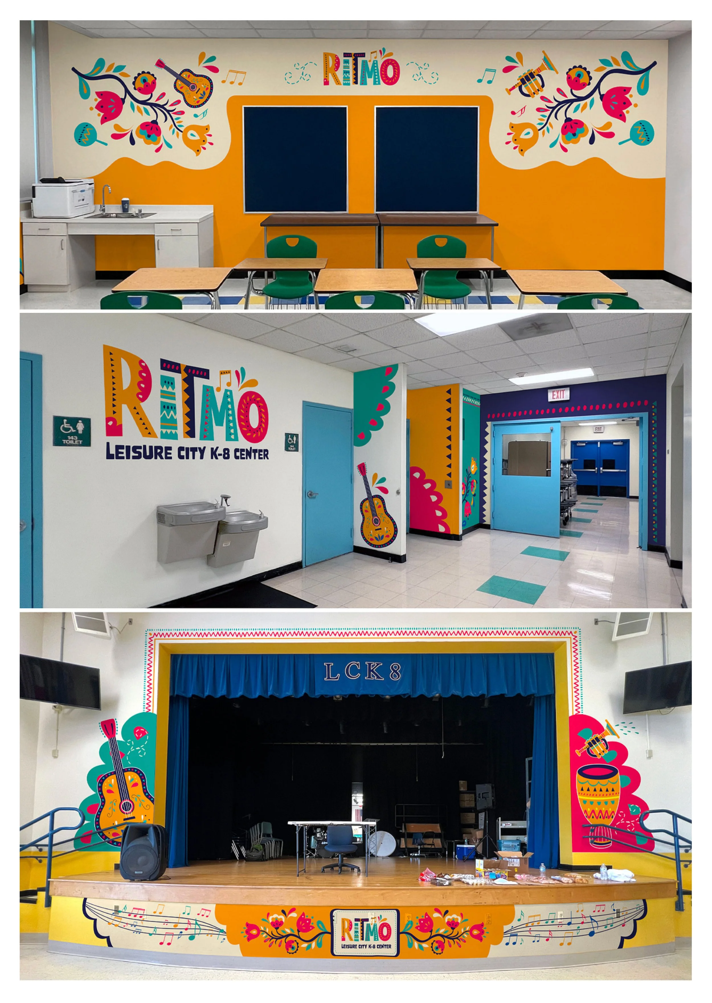
RITMO: Environmental Graphics
Role: Lead Designer
Project Type: Experiential Design / Educational Branding
About the Project: Following the successful launch of the RITMO brand identity, the next phase was to bring that energy into the physical halls of Leisure City K-8 Center. As the first mariachi magnet program in the region, the school needed more than just a logo; it needed an immersive environment. The goal was to transform the campus—from the exterior facades to the classrooms, band room, and main stage—into a cohesive, high-vibe space that would capture the imagination of younger students and celebrate the program’s cultural roots.
The Design Solution: Building on the patterns and musical motifs established in the primary identity, I designed a series of large-scale environmental wraps and wall graphics. The design utilizes a vibrant, rhythmic visual language that balances intricate folk-art illustrations with playful, oversized typography. By strategically framing key performance areas like the auditorium stage and integrating graphics into everyday learning spaces, the environment now acts as a constant, visual reinforcement of the program’s mission. The result is a campus that feels less like a traditional school and more like a professional conservatory, providing students with a professional-grade backdrop for their musical journey.