
"I always felt like the outsider, the weird kid who liked monsters and drawing. But then I realized that's exactly where the magic happens." – Tony DiTerlizzi
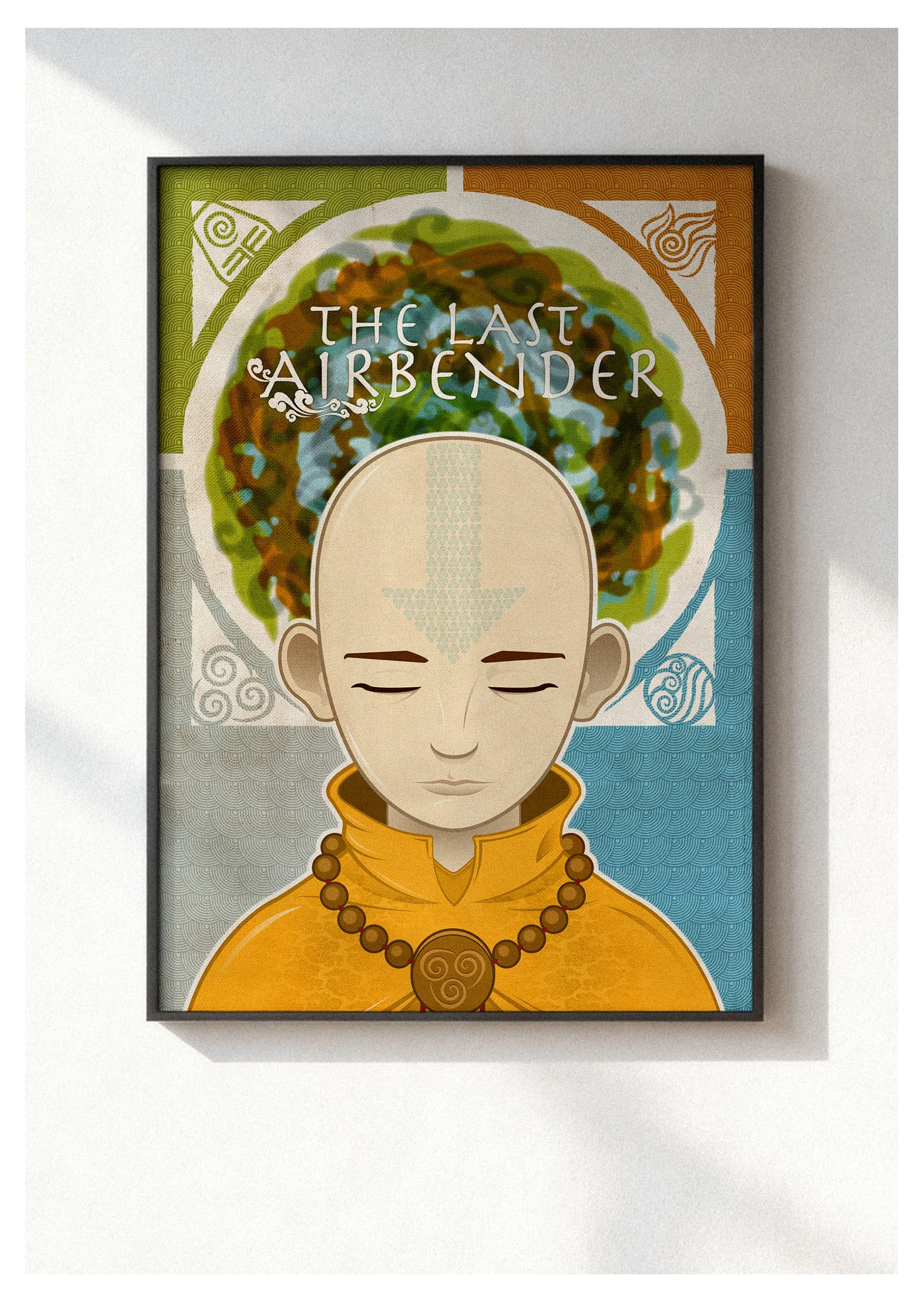
Nickelodeon Pop-up: Aang Poster
Role: Creative Director / Illustrator
Project Type: Limited Edition Print / Pop Culture Art
About the Project: Nickelodeon hosted a curated pop-up event where artists were invited to submit original interpretations of the network's most iconic animated series. This illustration of Aang was selected to be printed and sold as a featured piece at the event. The challenge was to create a design that resonated with the series' dedicated fanbase while offering a sophisticated, artistic perspective that distinguished itself from standard promotional character art.
The Design Solution: The illustration focuses on the spiritual core of the protagonist, capturing Aang in a moment of meditative balance. I utilized a layered, symmetrical composition, framing the character with the four elemental symbols set against rich, traditional-inspired patterns. By incorporating fine details—such as the intricate textures within the iconic arrow tattoo and the hand-painted feel of the elemental halo—the design moves away from flat animation and toward a more tactile, collectible art style. The resulting print serves as a peaceful yet powerful tribute to the series' legacy of mindfulness and elemental harmony.
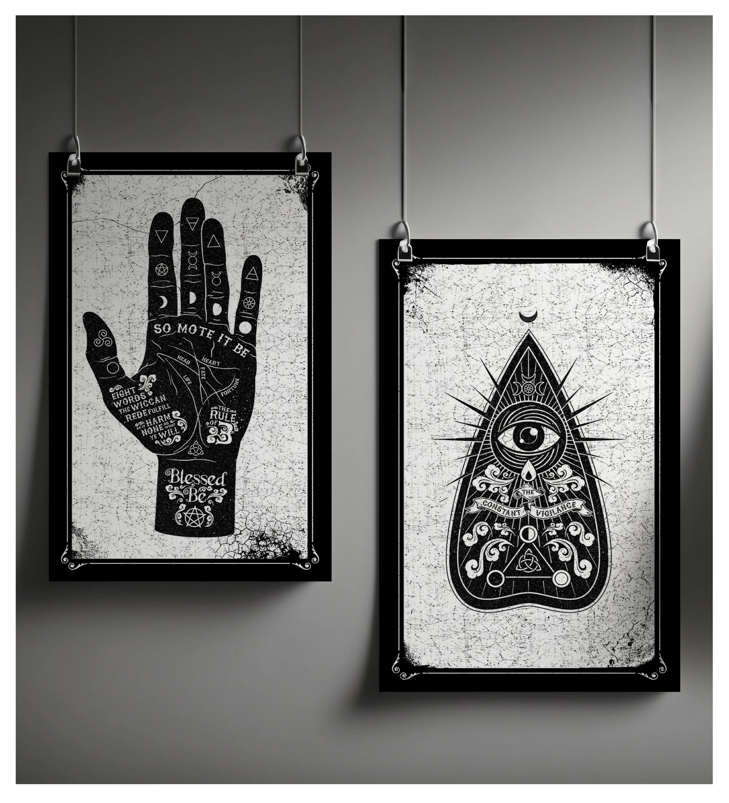
Occult & Wiccan Poster Series
Role: Creative Director / Illustrator
Project Type: Retail Illustration / Brand Extension
About the Project: The owners of a boutique new age shop commissioned a series of signature art pieces to anchor their retail environment. Building on our previous brand identity work for Mind’s Eye Chakra, the objective was to create two distinct yet visually harmonious designs: one rooted in Wiccan traditions and palmistry, and the other leaning into darker, occult-inspired iconography.
The Design Solution: I utilized a high-contrast, black-and-white aesthetic with a heavily distressed texture to give the prints an authentic, vintage engraving feel. The first design features a detailed palmistry hand inscribed with the "Wiccan Rede" and celestial markers. The second design centers on an occult planchette, where I integrated the "Third Eye" symbol from the Mind’s Eye Chakra identity to ensure visual continuity across the owners' various business interests. By combining intricate line work with esoteric symbolism, the resulting series provides the shop with a high-value collectible art style that resonates deeply with its clientele.
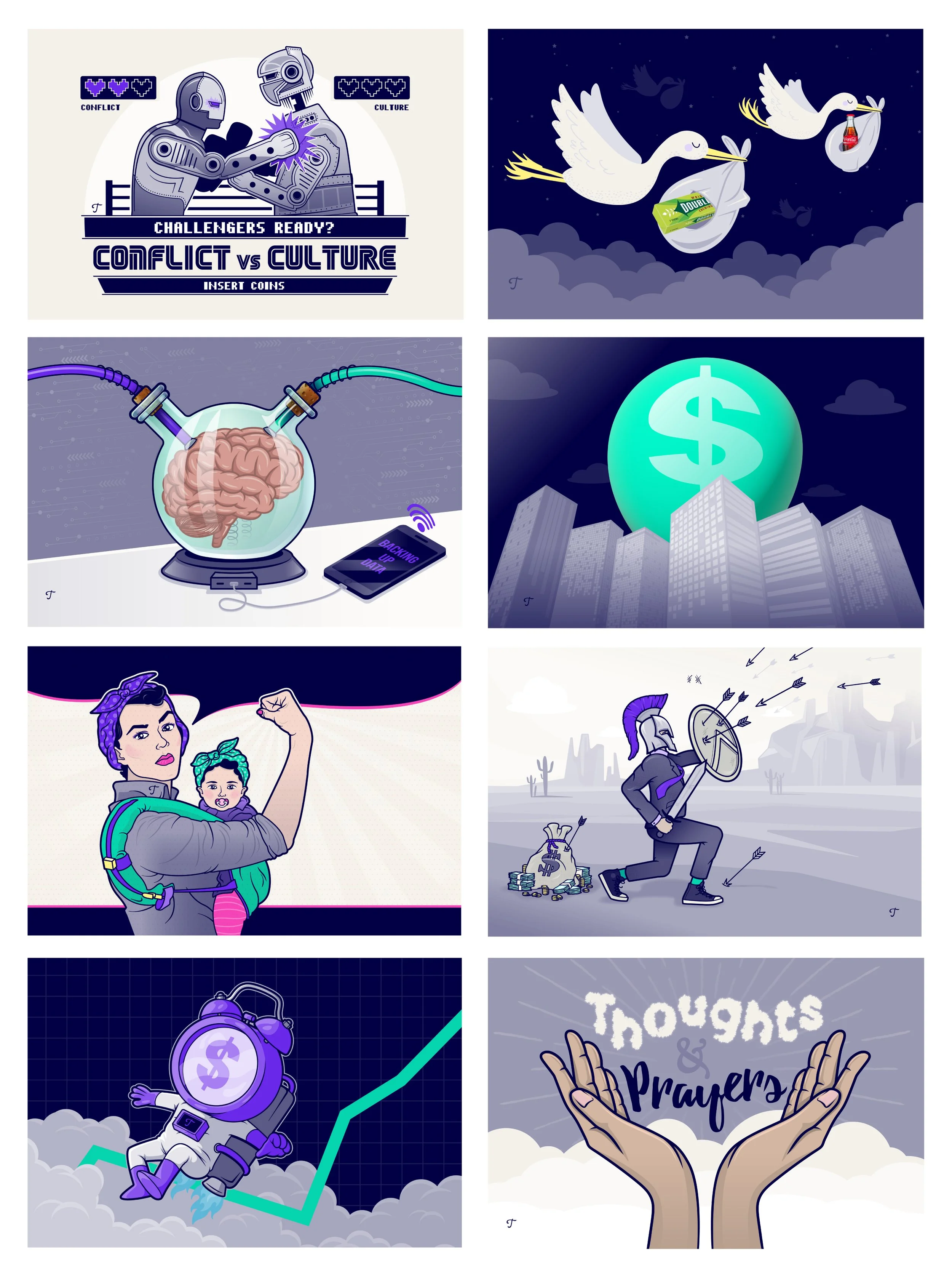
Trainual: Editorial Illustrations
Role: Brand Manager / Lead Designer / Illustrator
Project Type: Editorial Design / Brand Engagement
About the Project: Trainual’s weekly newsletter serves as a vital touchpoint for its community, tackling complex and sometimes dry business topics like corporate culture, hiring strategies, and recession-proofing. As the lead on this project, my goal was to provide a visual anchor for these pieces that could quickly communicate high-level concepts while maintaining the brand's energetic and approachable voice.
The Design Solution: I developed a library of custom editorial illustrations that translated abstract business ideas into witty, engaging visuals. Whether it was reimagining "Conflict vs. Culture" as a retro 8-bit arcade fighter or creating a modern, "hiring moms" spin on iconic pop art, each piece was designed to spark curiosity and drive reader engagement. By strictly adhering to the core Trainual color palette, I ensured that every illustration—no matter how stylistically diverse—felt like an organic part of the brand ecosystem. This consistent visual rhythm helped transform a standard newsletter into a sought-after piece of thought leadership, proving that business advice is always better when delivered with a touch of personality.
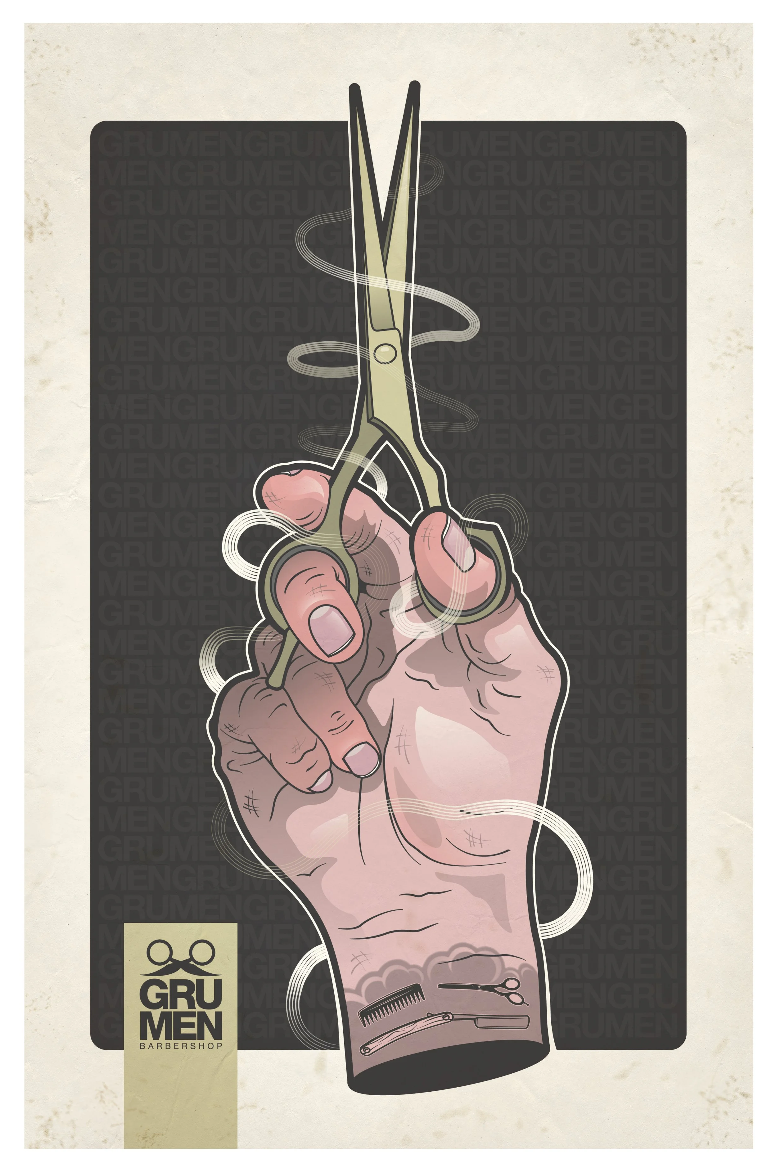
Grumen Barbershop
Role: Illustrator
Project Type: Promotional Campaign / Custom Illustration
About the Project: Grumen Barbershop isn't just a place for a haircut; it’s a destination focused on the artistry and craft of male grooming. To stand out in a competitive market, they needed promotional materials—a poster and a suite of stickers—that moved beyond cliché barber imagery. The goal was to create a visual identity that felt edgy, precise, and symbolic of the transformative "magic" their barbers provide to every client.
The Design Solution: The campaign centers on a dramatic, high-contrast illustration of a barber’s hand gripping a pair of professional shears. To emphasize the "craft" aspect of the brand, I incorporated custom-designed tattoos onto the wrist, featuring miniature barber iconography. An "ethereal" swirl of white light frames the tools, symbolizing the flow of creativity and the dynamic energy of the styling process. This powerful signature visual was translated into large-scale promotional posters and durable vinyl stickers, providing Grumen with a distinctive visual signature that resonates with a client base valuing both artistry and attention to detail.

Nintendo Pop-up Tour
Role: Illustrator
Project Type: Apparel Design / Limited Edition Merchandise
About the Project: Nintendo required a series of exclusive, high-impact apparel designs for a multi-city pop-up shop tour. The goal was to create merchandise that appealed to both hardcore nostalgia seekers and modern fans of the franchise. Rather than sticking to standard character art, the project demanded a fresh, illustrative take on iconic gaming figures that felt at home in a contemporary streetwear context.
The Design Solution: I developed a series of four graphic tees centered on classic "villain" characters from the Mario Bros. universe. Utilizing a high-contrast, single-color aesthetic with distressed textures, the designs give a vintage, "well-loved" feel to the modern graphics. Each character is paired with witty, custom typography that plays off their specific traits—such as "Fire Away" for Bullet Bill or "I’m the Bomb" for Bob-omb—adding a layer of personality and humor to the visuals. This cohesive system turned standard fan merch into a sought-after collectible, successfully driving engagement and sales throughout the tour's duration.
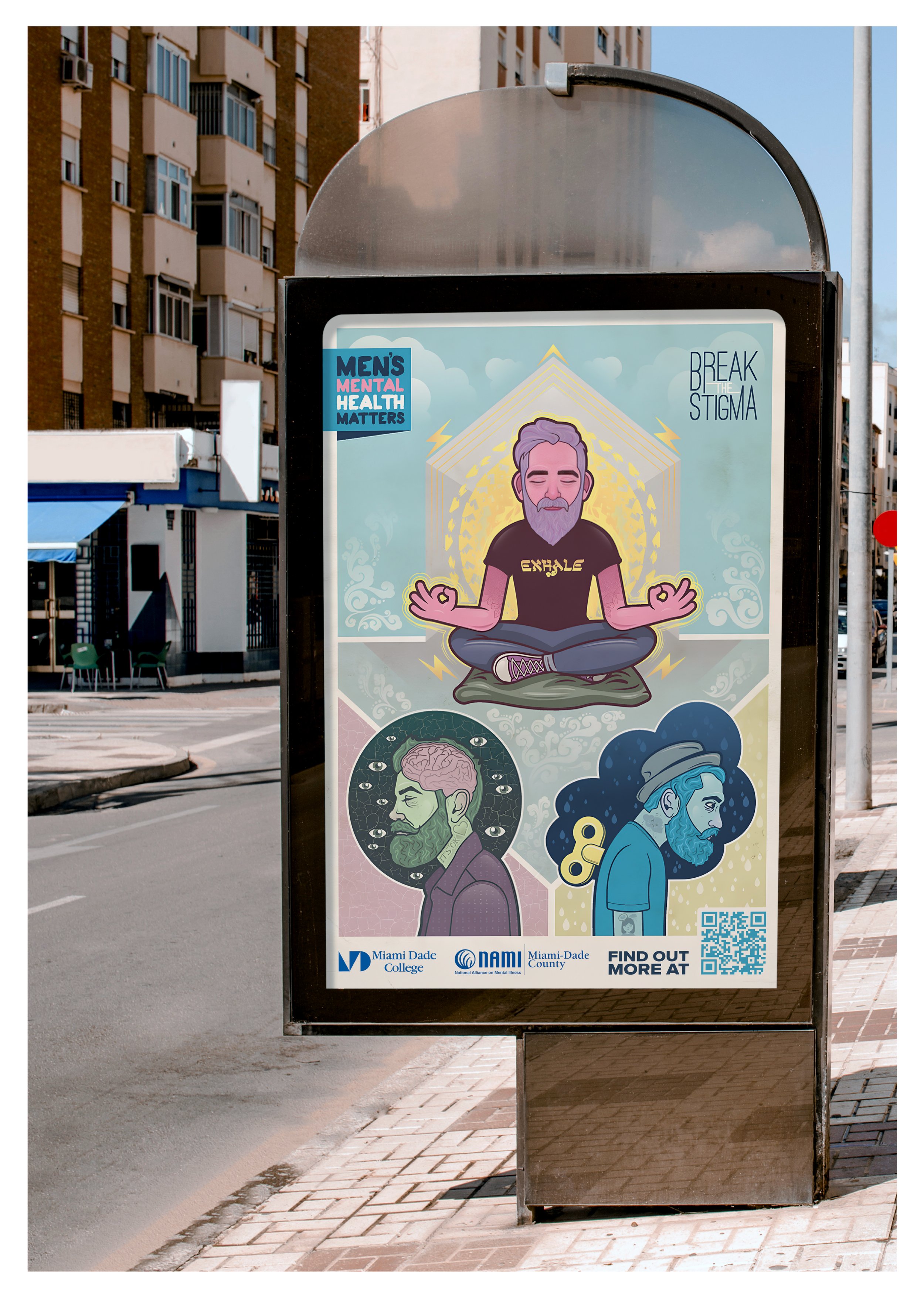
Men’s Mental Health: NAMI & MDC
Role: Lead Designer / Illustrator
Project Type: Public Awareness Campaign / Social Impact
About the Project: In partnership with the National Alliance on Mental Illness (NAMI) and Miami Dade College, this campaign was designed to "break the stigma" surrounding men's mental health. The objective was to create a public-facing visual narrative that resonated with male students and the surrounding community, encouraging a more open dialogue about emotional well-being and the resources available on campus.
The Design Solution: I developed a series of three character-driven illustrations that visualize different mental states: the peace of mindfulness, the pressure of overthinking, and the mechanical fatigue of burnout. By utilizing an approachable, contemporary illustration style and a calming palette, the campaign moves away from the clinical tone often associated with healthcare. The work was strategically deployed as high-visibility "street furniture" across all Miami Dade College campuses—appearing on bus shelters and vertical displays—ensuring the message reached students in their daily environment. To extend the campaign's longevity, each illustration was also adapted into a collectible vinyl sticker, transforming a public service announcement into a personal, portable symbol of support and awareness.